Orange is the core DNA of the Smartbox brand. To keep our interfaces clean and accessible, follow this simple rule: use the vibrant Main orange to highlight key elements and strictly reserve the Dark tone for text to guarantee perfect legibility.
Primary
Colours

1. Structure & Themes
Theme-Based Organization: the color palette is structured into vertical columns. Each column is strictly assigned to a specific thematic universe (e.g., Brand, Gastronomy, Wellness, Adventure).
Brand: The primary color (Orange) acts as the foundation and drives the global brand identity.
2. Accessibility & Contrast
The palette is engineered (with the APCA) to guarantee optimal accessibility and maintain consistent contrast ratios across all univers, preventing any visual cannibalization.
3. Digital Legibility Best Practices
On body style, to reduce eye strain and optimize the on-screen reading experience:
Avoid pure contrast: Do not use pure black text (#000000) on a pure white background (#FFFFFF), or vice-versa.
Recommended alternatives:
- Light Backgrounds use Black text on Clear background or Dark text on White background.
- Dark Backgrounds use White text on Dark background or Clear text on Black background.
UI Accent Colors: This specific color set is strictly reserved for interface status feedback to guide the user efficiently. Do not use these colors for decorative purposes.
- Error: Red (Error highlight / destructive actions).
- Warning: Orange (Warning highlight / cautious actions).
- Valid: Green (Success highlight / confirmations).
Digital Color Space (Display P3): To maximize the vibrancy and depth of our brand colors prioritize the Display P3 wide color gamut for all modern digital environments.
- CSS Implementation: Use the color(display-p3 ...) function for web development, but strictly enforce a standard sRGB fallback to ensure consistent rendering on older browsers and unsupported screens.
- Asset Export: Always embed the Display P3 color profile when exporting photographic, video, or rasterized UI assets to prevent them from looking washed out on high-end displays.
4. Print Guidelines (CMYK)
CMYK values must be calibrated on a case-by-case basis depending on the final print material (coated or uncoated stock), using the appropriate ICC color profile.
Default Profiles (Use these if no specific printer instructions are provided):
- Coated paper: Fogra 51
- Uncoated paper: Fogra 52
Primary
OrangeBrand
Secondary
RedGastronomy
Secondary
MagentaWellness
Secondary
PurpleAdventure
Secondary
BlueStay
Secondary
EmeraldStay wellness
Secondary
GreenStay Gastro
Secondary
BrownMtt
Secondary
GreyLorem
Accent
Accent
Accent
Rule
Compose graphic design only by using colors in a column.


Surfaces
When applying the Smartbox color palette, it is important to avoid a 50/50 split between two colors. This type of equal distribution breaks the dynamism of the composition and makes the visual less engaging.
Instead, aim for a clear hierarchy of color usage, where one color takes the lead (dominant), others play supporting roles (secondary), and a few serve as subtle accents. This approach ensures visual balance and flexibility.
Key Principle :
The rule is not limited to two colors. You can apply it with as many colors as needed, always avoiding equal dominance between them.
This proportional approach allows for consistency while giving designers freedom to explore creative combinations.
Example with three colours

Color 1 ≈ 70%

Color 2 ≈ 20%

Color 3 ≈ 10%

70%

20%

10%
Example with five colours
Color 1 ≈ 66%
Color 2 ≈ 17%
Color 3 ≈ 9%
Color 4 ≈ 5%

Color 5 ≈ 3%

66%

17%

9%

5%

3%
Usage & role of orange
Our brand must stand out while also blending with the experiences we offer. Orange plays a significant role in achieving this delicate balance.
- In contexts where the focus is on the brand, orange is a major component of the overall palette.
- In contexts where the product is the main focus, the brand matches the experience’s aesthetic, with only touches of orange remaining.
- Overall, orange is present throughout all touchpoints as a key element of brand recognition.
Owned media
It’s acceptable to use less orange, ensuring the design aligns with the overall brand aesthetic.
Paid Media
Orange must remain a dominant element to maintain strong brand visibility and recognition.

Brand
Product & experiences


Unbox your energy
70%
20%
10%
Graphic design

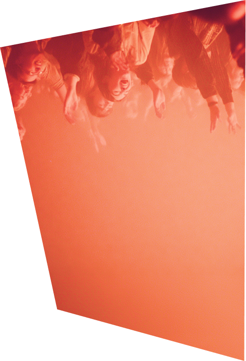
Unbox your energy
70%
20%

10%
Graphic design / photo / type


Unbox your energy
70%

20%
10%
Empty space / photo / type
Shapes

Principles and form
Our brand must stand out while also blending with the experiences we offer. Orange plays a significant role in achieving this delicate balance.
- In contexts where the focus is on the brand, orange is a major component of the overall palette.
- In contexts where the product is the main focus, the brand matches the experience’s aesthetic, with only touches of orange remaining.
- Overall, orange is present throughout all touchpoints as a key element of brand recognition.
Owned media
It’s acceptable to use less orange, ensuring the design aligns with the overall brand aesthetic.
Paid Media
Orange must remain a dominant element to maintain strong brand visibility and recognition.

- Deph

- Push

- Pivot

More coming soon

- Colour / colour

- Colour / iconography
Design System

Editorial guide
Text blocks are placed within clean, structured containers with sliced corners, that contrast naturally with the photography, ensuring perfect contrast and readability comfort.
Captions or secondary notes are aligned consistently and separated by subtle dividers, reinforcing the graphic system.
Exceptions can be made for very short text placed directly on the photo, but only when contrast is extremely high to guaranteed readability.


Sorem ipsum dolor sit amet, consectetur.
Gorem ipsum dolor sit amet, consectetur adipiscing elit. Etiam eu turpis molestie, dictum est a, mattis tellus. Sed dignissim, metus nec fringilla accumsan, risus sem sollicitudin lacus, ut interdum tellus elit sed risus. Maecenas eget condimentum velit.

- Suspendisse ac rhoncus nisl, eu tempor urna. Curabitur vel bibendum.


FAQ

Geometric & Angular Shapes
Build shapes using strict geometric principles. Prioritize straight edges, sharp corners, and clear diagonals over organic or curved lines.

Do: Use sharp, polygonal vectors with hard angles to match the brand's technical aesthetic.

Don't: Introduce bezier curves, rounded corners, or organic fluid outlines within custom shapes.