Our visual identity is built around the idea of expansion.
As an echo of the life-enriching IRL experiences that the brand offers, we have built a look and feel that expands each graphic asset :
from one-dimensional elements to new perspectives, from 2D vision to 3D and motion, from a discreet presence to iconic compositions, from objective iconography to immersive visuals.

Anatomy

Our new signs are designed with current assets in mind. Our aim is to give modernity, iconicity and strength to the brand.
The S monogram, expanded, amplified, extruded and animated through dynamic oblique lines, is paired with a wordmark inspired by the previous logotype, where soft and rounded angles meet straight angles and lines.
The logotype is mostly used in orange or white.
Occasionally and on products, it is adorned with the colours of the experiences it promotes.

Monogram

Wordmark

Logotype
Usage

The monogram is our most flexible asset.
Its various treatments allow us to play on contextuality and immersion, and to build iconicity while exploring diverse moods and products.
The following examples display a selection of graphic and visual explorations, from the most minimalistic and iconic to a full integration of the brand in the IRL world.

Iconic
Dynamic

Graphic
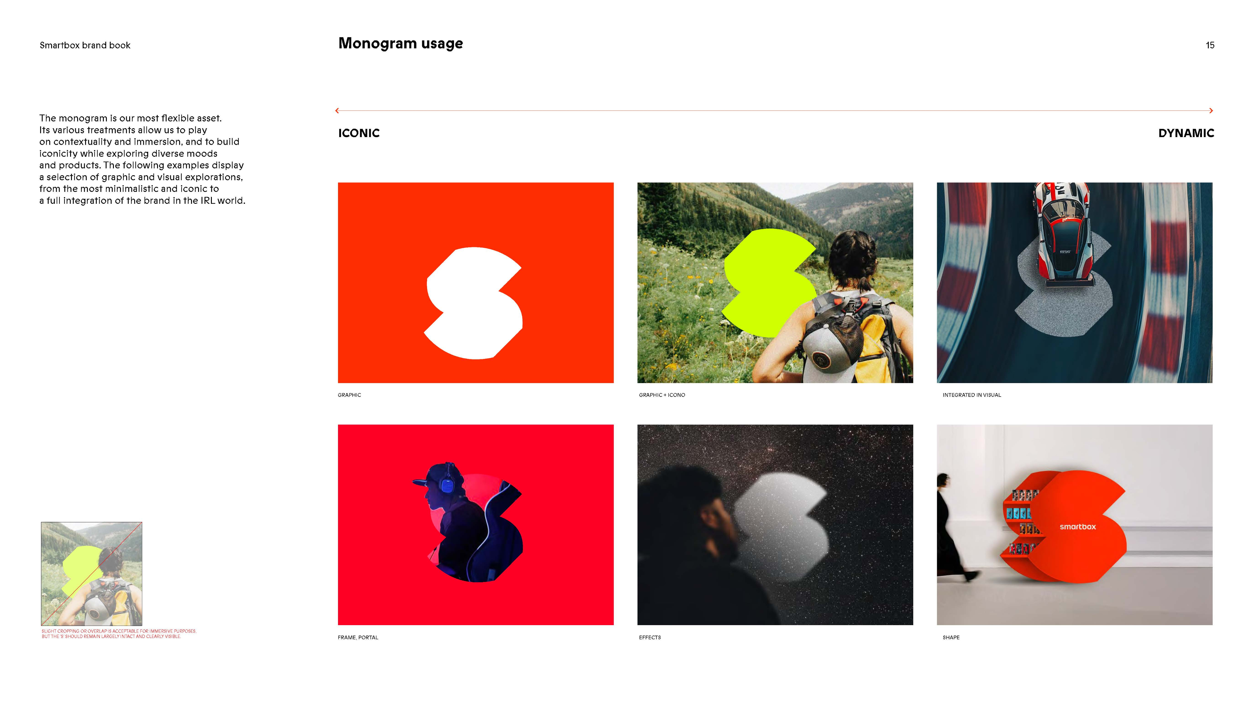
Graphic + icono
Integrated in visual
Frame, portal
Effects
Shape
FAQ

Overlapping the Monogram
You can layer imagery over the “S” icon, provided its core silhouette remains instantly recognizable.
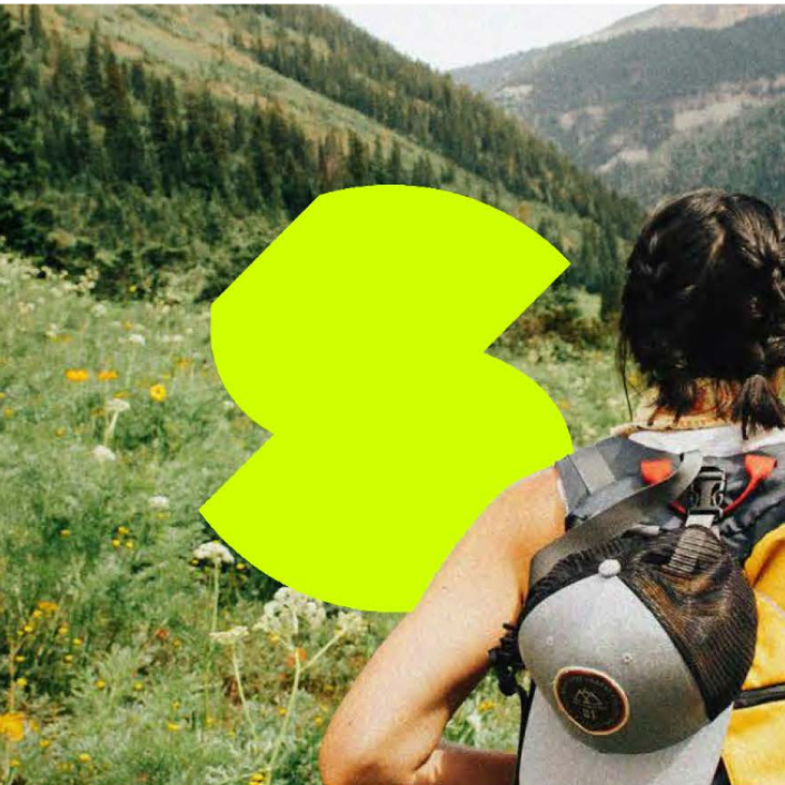
Do: Clean depth effect where the subject naturally overlaps a secondary part of the icon.
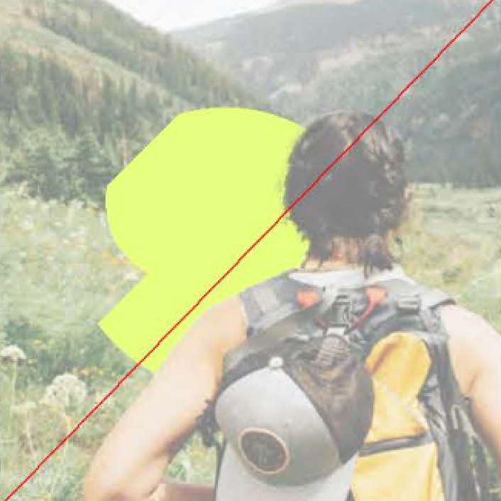
Don't: Excessive cropping or obstruction. Avoid hiding key structural curves that define the “S” shape.